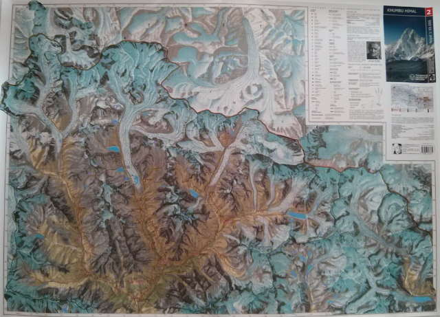
British Cartographic Society subscription and get The Journal for free!). Long read...
As 2013 turns into 2014 and we reflect on the state of cartography what do we know, what have we learnt and what might the future hold?
Well, maps have changed...quite profoundly and quite irreversibly. Maps are omnipresent; ubiquitous; largely self-aggrandising; transient; personalised even. Many are single purpose, single-themed and exist to exist because so many more people make them now than they did 10 years ago. They are often used to demonstrate a technical approach or a dataset rather than having a purpose beyond merely being made. They too frequently come with quite disturbing bias and uncertainties which are ignored by the author and unseen by the reader. The type of person that makes maps now extends from the cartographic professional to data artists, journalists and coders hacking together the latest data the internet has made available. They map this, they map that, they move on. Is modern mapping showing signs of autism, being characterised by repetitive behaviour? Certainly a lot of contemporary mapping exhibits a serious lack of development of the understanding of cognition and the language of cartography and many map-makers repeat some basic mistakes that has professionals wincing. Or maybe modern mapping is simply showing signs of immaturity as it seeks to emerge from a fast-paced technological change that has characterised its recent development? Maybe we're just seeing the reinvention of mapping in its tricky adolescent stage and its struggle to overcome growing pains. The maps know they're always right; they answer back; they're often rude to the point of arrogance and disobedience but they'll grow up eventually; and all the time the parents hover with sage advice that is rarely acknowledged. The professional cartographer vs amateur map-maker debate rages on which is why I opened this Editorial questioning where cartography is, yet have reverted to using the term mapping. Mapping, to my mind, is what anyone can do. Cartography is what some of us do. A lot of the former and not much of the latter made the headlines in 2013.
2013 also saw another leap in map-making technology. The web is now becoming the publishing mechanism of choice for many people because the barrier to use has reduced dramatically. That’s created a demand for mapping tools with most major players offering a web option for making maps. Some are free. Some you can subscribe to. Some are packaged with other licenses. As more data becomes freely available then the push for free mapping tools continues and people are using them. Empowering indeed but I'd wager this type of map-maker has never really looked upon a Coronelli globe, or pawed a SwissTopo map sheet, or been amazed at a Berann panorama. For every one inspired individual who has a magic touch and creates beautiful work there are dozens of terrible maps. Map-making, then, is in rude health but it's a cacophony of cartography...a harsh, often discordant mixture of the weird and wonderful. Maps are everywhere but it’s worth repeating: a cartographic product is a map that has been constructed professionally. A map-like product can be made by anyone...a mapper, not a cartographer. That distinction has, unfortunately, become somewhat irrelevant and I was recently invited to point to great examples of cartography by providing a list of URLs. Well here's the thing...not every map comes with a URL. It's fruitless pointing this out when a list lives online because it simply ignores any map that doesn't have a URL. URLs gives ease of access for so many but also causes a problem. People see what they see online and that becomes their cartographic baseline such that when they get round to making their own maps that's where they get their design cues. This then perpetuates the idea that mapping begins and ends with the internet and so we're developing a society whose standards and very belief models are driven by online maps and mapping. This needs addressing because there's a wealth of great work being ignored by the mapping masses because they don’t know it exists. It’s revered by cartographers but unseen by map-makers.
It’s inevitable that the cacophony will continue apace. As we move into 2014 and beyond our technology will continue to improve and undoubtedly create new opportunities for mapping but unless we strive to reveal better examples then people's appreciation for quality will become harder to tackle. My hunch is that we'll see more temporal maps as animation becomes easier to work with and more 3D as browsers become more capable of handling the graphics. So much of the data we can now work with has a temporal component or a third dimension so the search for optimum ways of revealing meaning has to be at the fore of cartographic work. We’ll also see more moves in the open source and open data community and social media data will continue to be worked over as people strive to make any kind of sense of it. Trouble is, as so many of today's maps amply demonstrate, data is simply placed on a map, in a sequence and the viewer is supposed to make sense of it and be amazed. They are...but for the wrong reasons. They like the novelty but beyond that? Lots of data (often mistaken to be 'big data') needs generalising and simplifying but rather than making sense of lots of data by portraying salient aspects efficiently so they stand out, maps will continue to strive to just show more and more as if more is always better. Less, of course, often reveals more but in a cacophony, the loudest maps often get heard the most above the general din.
As people who spend their life immersed in maps, cartographers have a particular perspective on the state of cartography as I'm sure most readers of The Cartographic Journal can relate to (that’s why you read this!). We hear all the latest buzz about this map and that map but where is this cacophony coming from? We're seeing the maps we're seeing because of one thing...the public has an appetite for them which is driving another process altogether. Where there is a demand, someone is always going to meet the demand and there are numerous online forums, sites and commentators all clamouring for a slice of the new golden age of cartographic pie. The demand at the moment however is for quantity, not quality and the internet, not the discipline of cartography, is reacting to that demand.
Take, for example, the Facebook and Twitter pages of 'Amazing Maps'. They have tens of thousands of followers...the sites exist simply to push maps that are found on the internet to their followers. I'm one of them but for every one that piques my interest and which I find genuinely intriguing, well made and purposeful, there are dozens more that fail on a very basic cartographic level. Often the maps display disturbing mistakes. I see them. So do other experts. But many public do not...they are busy being experts in their own field and simply see the map, consume it and move on. The difficulty here is that there is a natural assumption that ‘Amazing Maps’ (and other similar sites) are in some way curated by experts who are undertaking a process of careful selection. They’re not and so we’re as likely to get utter rubbish alongside a decent map. The apparent authority of the name itself gives people a false baseline. Bad maps are bad for you simply because you get the wrong message. It's a waste of calories. I'm all for quick and dirty maps made well...but not ones that are constructed poorly. I mentioned this myself on Twitter a while ago and someone said to me that yes, they agree but while they like fine restaurants they also dive into Subway on occasion. The food analogy is easy to relate to but I think it needs to be more subtle here. Sure...go to a Gordon Ramsay restaurant and enjoy fine dining (with expletives, obviously). Go to Subway and enjoy a sandwich too. Both serve different 'qualities' of food and you would never expect a Subway to serve up the quality that you know to expect from fine dining. However...would you want to go into Subway and order a cheese and pickle sandwich that comes with the cheese on the outside, trying desperately to envelop some bread with a coating of pickle for good measure? At least Subway construct their sandwiches according to the basic rules of sandwich construction so it works as a sandwich. Bread on the outside, filling in the middle so it works (regardless of its taste or nutritional quality). Discounting Heston Blumenthal, there are very few chefs who take their ingredients and use them in ways no-one in their right mind would conceive of yet still manage something that delights the palette. Yet people are mashing up all sorts of ingredients on maps and creating inedible fayre. That, for me, is the problem with a lot of contemporary maps...they suffer from basic constructional issues that really affects their performance as a map. If the public doesn’t know the difference in the nutritional quality between a well constructed map and a poor one then there is no hope of them knowing whether what they are consuming is any good for them. The maps that get peddled on such sites are being selected because they are pictures. Often you struggle to see what their purpose actually is so in that sense they fail to function as a map because the person who made them wasn’t particularly concerned about the qualities of a map…they wanted a picture and a map seemed relevant. Their entire purpose is to provide quick visual delight and nothing more so to do so they often break fundamental cartographic rules. Some of our cartographic rules are there to be challenged but some are there to maintain standards. If many of our new maps ignore the rules they are simply ignoring what is good for them so they fail as a map yet delight the curious who are just wanting a picture of something vaguely interesting or entertaining. The appetite is there because the 88,000 (actually it's risen to 135,000 since I wrote this article) Twitter followers that @Amazing_Maps has dwarfs the combined Twitter following of virtually all of my map expert friends combined. Just by way of giving you a sense of scale I have 1300 Twitter followers, the British Cartographic Society (@bcsweb) has 750, our President Peter Jones (@geomapnut) has 66 (come on people…help him out!). Mapbox (@mapbox) has 16,000, Esri (@esri) has 35,000, and my dog Wisley (@wisley_dog) has 9. You could make a good argument that any in this latter list is more authoritative than ‘Amazing Maps’ and you’d be right….but people go to ‘Amazing Maps’ and that’s what they consume.
Tabloid newspapers have higher circulations than quality broadsheets and this is what’s happening to satisfy the public’s appetite for maps. No-one seems particularly bothered who made the map and what their cartographic chops are.The reporting is dubious but it sells. I would strongly argue that being authoritative in your domain is crucial in distinguishing your work from the masses but if the tabloids don’t particularly care it becomes a moot point. It's therefore not the fault of the makers of map-making tools or the map-makers themselves that we see so many poor maps. It's the consumers, where they go to get their daily fix and the negative feedback loop this generates in terms of informing their own work. Just like any service based on mass consumption, if the demand is there, there will be someone keen to feed it regardless of the quality. The demand is for maps, good, bad, big, small, whatever...as long as I can click to see it and then click to see another. As long as I don’t have to put in too much effort and it vaguely tantilises my tastebuds (pass the salt). There are plenty of people and organisations that have set themselves up in the last few years to satiate the demand purely to serve their own agenda of being purveyors of content just like ‘Amazing Maps’. How many of these have any real cartographic credibility? Take a look...you won't find many publicly visible examples that have a strong cartographic background. If we look at some of the most popular web sites who routinely ply maps to the internet and check out their so-called best maps of 2013 we can see the point illustrated.
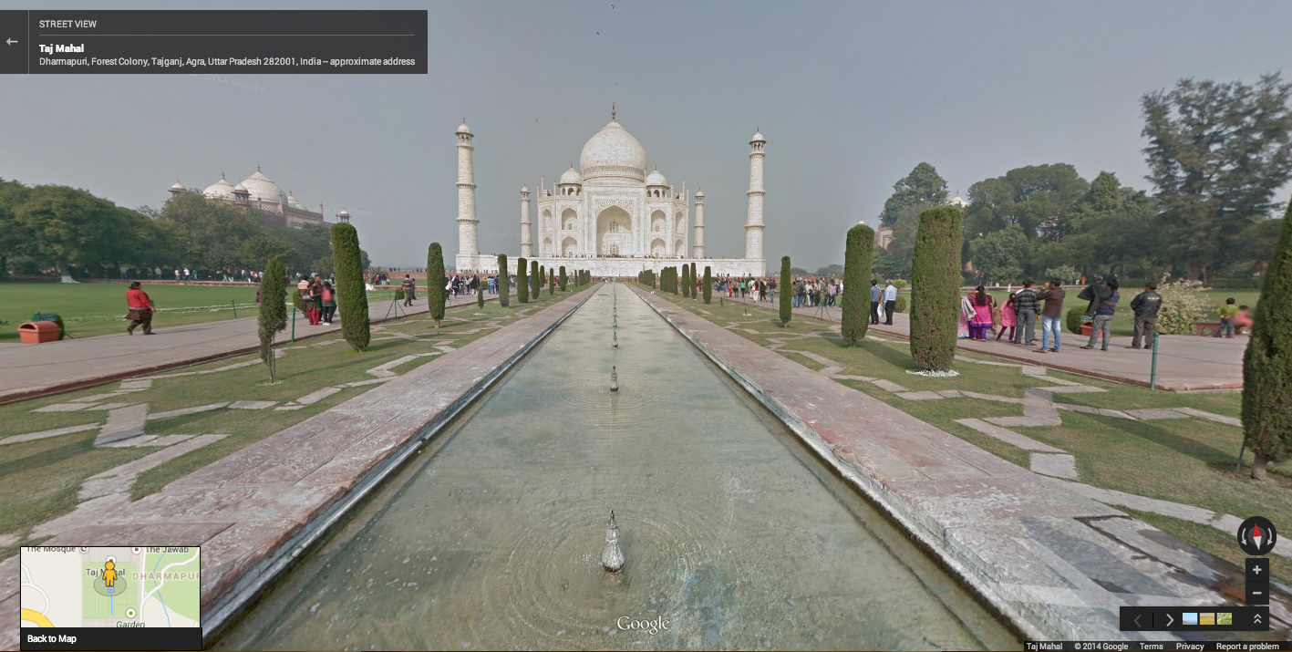
Figure 1. Wired Maps
Run by two self-admitted map novices, the Wired Maps blog has become an interesting repository of the internet's offerings. Here they mix the contemporary with historical curiosities with an eye on what went viral though claiming they were all relevant in 2013 is odd when you look at some of the historical examples. There's nothing in the title of the list that suggests 'great' in cartographic terms yet the list is described as being that of 'great maps' and 'favourites'. The question of greatness has to be measured against something though...page hits? their own subjectivity? professional judgement? As with all the popular lists, that's not entirely made clear so it is what it is...a list of maps that piqued their interest. What I like about their list, however, is a mix of new and old. It's not, like many others, confined simply to maps that you view using a URL. There is a world of mapping beyond our glass interfaces that they acknowledge which is good to see.
Figure 2. Fast Company
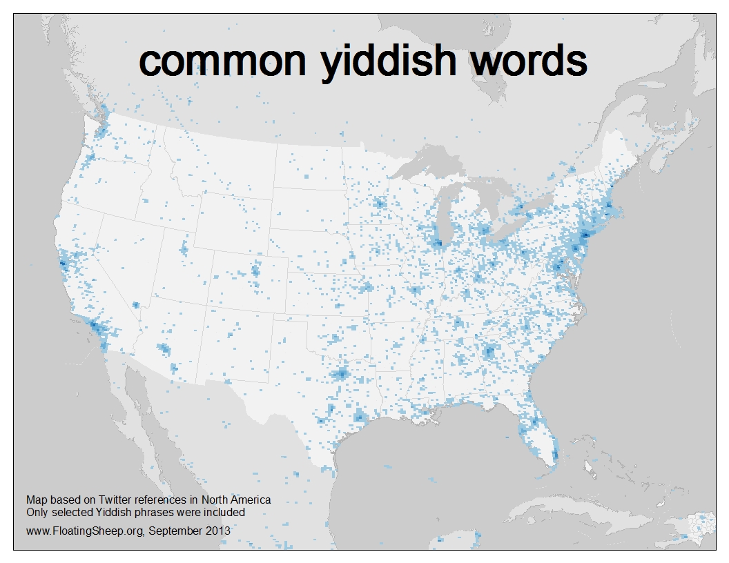
These maps are U.S. focussed and specifically about how we look at the U.S. in terms of some interesting themes...language, expenditure, tweeting etc. Purely thematic but at least there's some coherence in the categories of maps that they have chosen to explore. At least there's a focus to the list rather than a collection of random curios. That said, this is possibly the weakest list in purely cartographic terms. Some interesting data and themes but poor craftsmanship. This is largely due to them being a range of thematic overlays mashed up on basemaps that tend not to support the purpose. So we see the usual problems of overprinted labels, Web Mercator defaults and thematic maps on top of topographic basemaps. The language and twitter maps, in particular, go the heat map route and Fast Company clearly go for maps with highly saturated colours.
Figure 3. Slate
A really rather bizarre set of maps that range from the most basic push-pin overload efforts to maps that support online quizzes to historical and heavily pictorial maps. The one striking aspect of Slate's list is the variety of map they chose. They are extremely inconsistent in cartographic terms which suggests that Slate are more interested in the novelty value of the map rather than its inherent quality as a map. We get Bob Dylan's world, a map of etymologies, maps of Starbuck's locations, American folklore and 'This amazing map shows every person in America'. I love this last one...labelling the map using the adjective 'amazing' in itself is genius. The map wasn't actually titled that way...but Slate's own blog came up with that blog title and so the amazing map was born. It is, of course, in Mercator and mapping at the one dot = 1 person from aggregated census data plays fast and loose with the ecological fallacy.
Figure 4. Gizmodo
A list heralded as showcasing a 'banner year for beautiful, information-dense cartography'. The maps actually illustrate Gizmodo's panchance for what might be termed boutique mapping...where really obscure datasets are the interesting aspect and the map has been used as a way of tapping into it. So we get maps of most popular names, the age of every building in New York, internet connections, proximity to pizza, where American's are moving, swimming pools in Los Angeles and the rise of craft beer. It seems that if you can get your hands on some obscure data that effectively writes its own headline, the map will instantly become 'liked'. You'd be hard pushed to get a professional cartographer to 'like' them in terms of quality cartography though. In fact, a number contain some pretty hideous errors in construction that have clearly gone unnoticed by the majority. Is that a problem? Well yes...because it changes the message. A banner year? Hmm...what these maps show is people can access really interesting datasets fashion them into maps and give them a URL, some with innovative user interfaces. This trend will continue in the short term at least.
Figure 5. The Atlantic
Titled as a 'favourites' list, actually The Atlantic's list of 7 maps is interesting because it attempts to go beyond choosing maps based on novel or useful information. Instead, it picks out maps it suggests 'we've never seen before' due to their manipulation of time, dimensions, perspective and atmosphere. They herald their picks as being 'innovative in design' and that they have set a new bar for 2014. Maps are picked out for being cloudless, personalized, real-time, animated, comparative, predictive, lots of dots or 3D. None of these are new though. The fact they portray them as new simply shows they know little about cartography and are ignoring that vast body of work that has gone before. So these may be new to The Atlantic writers and are more than likely new to the people that made the maps but let's have a little perspective here...just because you aren't aware of prior art doesn't mean they are new. What The Atlantic have done better than most, though, is showcase maps that are, for the most part, well produced and they are certainly of a better quality as a collection than many on the other lists. Interestingly, while the likes of Mapbox and Google are trying to apply sensible cartography to produce better products (generating cloudless imagery or generalizing content based on the person viewing the map), for others the map is an opportunity to dump data. Take the meta-map of OSM contributors for instance (Figure 5 bottom right). What can you really see? Colour used to signify the more than 1 million OSM contributors makes it meaningless. It's just a view of data but not a map.
Figure 6. GIS Lounge
A mixed bag here, referred to as the 'most interesting and best maps of 2013' but which goes on to admit that in fact the maps selected were based on those that seemed to resonate most strongly with people and which produced the most public reaction. Interesting approach...so the masses on the internet get to determine what is 'best' based on what has become most popular? In that case, make the list one that simply showcases the 'most popular' rather than inferring that they are therefore the best. Again...there's cartographic flaws abound and some of them are quite serious. Does the fact Justin Bieber has such a great following make his music any good? Does the fact McDonalds sell billions of burgers mean they're nutritious? Of course not...and there's nothing wrong with those two examples but no-one claims they are the 'best' of their genre. They sell. They do it well. They are simply the most popular.
I would like to think that the top 10 lists are not what we aspire to because let's be honest... apart from a few examples that genuinely add to the canon we can do better as cartographic history proves. Most of the maps are not innovative or new. Mostly the lists are compiled by non-cartographers (non-experts) so it’s questionable whether their view can be deemed authoritative in any sense. Some are simply regurgitating what's been most viral during the year which is pretty lazy. How many have gone beyond their keyboards and screens? How many saw the work on display at any number of cartographic conferences this year? That answer is probably zero because none of the lists above include any work that won any number of awards at cartographic conferences during the year. Neither do these lists pay any attention to commercial cartography, national mapping or any other major cartographic activity. There is a vast wealth of cartographic riches that are totally ignored because it’s not self-promoted and not available in a bite-size format via a URL promoted by an irrelevant social media non-expert account. So we have a situation where experts give kudos to one set of maps that are unseen by the popular purveyors who give kudos to a completely different set of work.
There are only 5 maps (out of 66) that appear on more than one of the lists I've reviewed here. Of those, only two make it onto three lists: Ollie O'Brien's Bike Share map and Joshua Katz's American Dialects map. I made my own 'favourites' list this year and neither of those made the cut. In fact, 6 of the 11 I selected didn't appear on any of these other lists. So the winner is...diversity. Perhaps in pure cartographic terms they all contain limitations and we can pick them apart for what they don't do rather than what they do but one thing's for sure...cartographic beauty is at least in part in the eye of the beholder. And what of the concept of ‘quality’ anyway? Isn’t that in some ways a subjective ideal? There is as much subjectivity in what we see as 'worthy' as there has ever been because cartography is part art. What works for one person is not necessarily the same for another and that subjectivity is precisely why there isn't more commonality across the lists and precisely why mapping is such a diverse church. Even lists based on expert opinion fail to reach consensus. The survey I did with Damien Demaj a while ago showed that professional cartographers themselves have their own favourites and ideas of what they feel is in their own personal top 10. This is to be expected because cartography is as much about how we value aesthetics and our own perception of quality. Some maps trigger an emotional response. To a cartographer, though, many of the maps in the lists reviewed here simply don't make that connection. They do not trigger that awe. To amateur map enthusiasts who are perhaps more interested in the technical way a map was produced, or how the data was manipulated, or the cool UI design...it creates the emotional response they seek.
Therein lies one of the fundamental differences in the way I (and other cartographers) might look upon a map. We're looking at the value of the cartographic work. Cartography is the focus. To gain our respect it has to achieve more than what most can produce; it has to speak to us, communicate, and do it efficiently. But with most maps now being made by most people with so few having the touch of a cartographer involved it's no surprise that so many fail to get us so-called experts excited.
For most of the examples above we can point to far more nuanced examples of the genre or the technique. There's prior art for much of what we see today that is better crafted. One's never going to be able to excite a public hungry for 'new' examples by showing them something made 20 years ago if it doesn't come via a URL...but how, then, do we encourage a public to develop a better sense of quality, a better sense of cartographic taste? This is a huge question but in an age where you'd hope that brain surgery was done by a qualified neurosurgeon, your car service done by a qualified mechanic, your divorce settlement handled by a qualified lawyer, your tax accounting handled by a qualified accountant why is it that we accept maps that are handled by anyone and everyone? There is such a thing as a profession of cartography; a body of professional cartographers. It is these people who need to stand up, produce great work and show the world that quality matters…otherwise the cacophony will simply grow louder and more discordant.
There are other impacts to the popularisation of map-making. It’s not just where people see their mapping and take their design cues, it’s where they now seek the knowledge to make their maps. I was disappointed to read the preface of a textbook a couple of years ago which said quite blatantly that the author was not schooled in cartography but because they couldn’t find any books on the subject they felt it necessary to write one. I was astonished since there are dozens, most of which were far more useful and well written. All this illustrated was this particular author hadn’t cared to look (the book wasn’t particularly good either). This phenomenon has now transgressed onto the internet. There are some really well produced online resources (e.g. The Geospatial Revolution videos and MOOC from Penn State University) but there are also others that just leave me scratching my head. While I’ll not point directly at a particular site (mostly because the author gets really quite uptight), very recently a new online resource appeared to provide a ‘free introduction to geo’, GIS and cartography. The author’s expertise is as a programmer. He has openly shown disdain for cartography and its history, rules and prior art across social media. Yet here he is, creating a slick online set of resources to ‘educate about mapping’. Slick in the sense of it looks nice but you don’t have to dig very far to spot the problems. It’s mostly utter nonsense and anyone with a vague knowledge of geography, cartography, geo or GIS can blow holes in some of the gross generalisations and misrepresentations. But then he pickes up nuggets here and there (usually after a period of Twitter related mud-slinging with people who know better) and then passes them off as if he's the expert. Yet it’s this sort of tabloid nonsense that gets traffic. There’s no consistency to his work but people like it because it isn’t challenging and they don't have to go far to find it; it makes making maps appear to be rather simple and requiring minimal knowledge; it validates their own desire to see something as quick and easy (and free); it justifies their belief that experts like making things difficult to preserve their expertise; and that this new breed of map-makers has somehow tapped into a magic that makes map-making trivial and simple. This individual, with no cartographic background whatsoever who is now professing to be a one-stop-shop for people who want to learn how to make maps has nearly 3000 followers on Twitter (if you're following then you're spotting a pattern).
So we're awash with tabloid reporting of tabloid mapping and tabloid style courses teaching people how to make maps poorly. Mapping is mainstream and it's now news worthy for those that don't want to look very far or deep so we digest a daily diet of this map and that map. Somewhere in the mix, though, the rasion d'etre of cartography has gone awry. Making a map used to be all about communicating something meaningful to a reader. The map itself is merely a document that someone consults to learn something. It's a vehicle to take that person along a particular route and guide them to a destination. The same is true for maps that support navigation to maps that support the understanding of global economics, or patterns of breast cancer or election results. But tabloid reporting offers little or no critique and a map is 'liked' for the mere fact it's a 'map'; a 'cool map' even. How many of the maps that appear in these top 10 lists are described in terms of the meaning they impart, the analytical task they support or the understanding they reveal? Not many. Most are in the mix because they are simply 'maps'. There's little attempt to understand whether they communicate their content efficiently, effectively or meaningfully. They just map. Which brings me back to the point about professionalism in cartography. The people selecting these lists are no more a map expert than many who populate their lists. They’ve also now moved to make web sites to tell people how to make maps. It’s a cartographic bypass. How is it that they are able to assess relative quality in the maps they see or in the statements they make? There's no real rigor to their process, no judgement made by people who know the profession. To be fair there's nothing wrong with anyone making a list of 'favourites' but where's the domain knowledge? Making a good map needs two essential drivers: domain knowledge of cartography and domain knowledge of the theme being mapped. Teaching about cartography needs more than domain knowledge; it needs evidence of practice, engagement in the cartographic community and also the ability to develop materials that are well researched, rigorous and based on an understanding of pedagogy. Maps made by coders whose domain knowledge is coding and doing fantastic things with data does not necessarily make a great map. Their main goal, I would suggest, is challenging themselves to do something innovative with the data and to make something that simply looks cool. Do they really have the intent to communicate something about the data or is it simply just mapping of the data? We see this so often...an interesting data set mapped poorly which, in the hands of a professional cartographer (or even a semi-skilled non-professional) and someone seeking to understand something about the data could reveal something so much more. Likewise when they turn their attention to trying to educate the rest of us about cartography. I prefer my education to come from people who know what they’re on about and I would like cartographers to use 2014 as the beginning of a drive to reclaim cartography.
I would like to see 2014 belong not to the new map-makers and their lists and courses but to the map-consumers who find more appropriate ways to get excited about maps and learn about how they are made. I'd like to see a public whose appetite for maps is matched by one that demands better quality and who are better informed about where to seek advice on making great maps. I would like to think that over time, this might emerge as more people tire of the cacophony and, instead, seek the few examples of great work that are truly engaging and well crafted. Is this even a possibility or are we beyond that point already? My sense is the latter is the default for a while yet but it doesn't stop me from some altruistic goal and a call to arms. The cacophony is simply too deafening at the moment. It's beholden on makers of maps to learn a bit about mapping so their work is at least based on basic tenets. It's also necessary to improve the diet that consumers are gorging upon to improve their appreciation for something that tastes better and to give them better materials to educate them. We, the so-called experts, retreat to our cartographic societies, our clubs and our friends who share the same concerns and see the world of mapping through similar glasses. We hope for a future where more people have the sense to pause before 'liking' but we rarely put our heads above the parapet.
So what's to be done as we move into 2014 and beyond? In addition to continually striving to improve the quality in The Journal and its international scope and presence, colleagues in the ICA Map Design Commission and I have pledged to write a daily blog during 2014 to showcase the very best in classic and contemporary cartography (see www.mapdesign.icaci.org). The intent is to build a repository of 365 maps that cover the breadth of cartographic practice to illustrate, explain and emphasize the importance of map design and to give URLs to quality maps. We believe there is no other similar repository and instead of fighting the internet and the tabloid mapping we see, we’re using it. It’s the equivalent of introducing a new quality publication. By the end of the year we will have created a compendium that can act as a reference for high quality cartography. Some of the maps you’ll have seen before…some possibly not. We’ll include both traditional print cartography and the very best that the internet has to offer. Each map will be illustrated and accompanied by a brief comment or two on why we feel the map exhibits great design. Hopefully the maps we’ll showcase will provide a barometer for modern map making, inspiration for those who seek ideas for how to map their data and also to improve the public’s appreciation of and demand for quality in maps. We need people to promote the repository so please do look and share the links amongst your networks. BCS has done well over the past few years with the excellent Better Mapping series and the Restless Earth Schools programme but as a community of cartographers we need to engage with the vast number of online mappers and make a stronger statement. Quite simply, we’re only scratching the surface along with similar cartographic societies the world over. The cartographic profession more generally has to step up to provide better examples of mapping and in places that are visible to modern consumers. We also have to develop our outreach as a profession and become more friendly, inclusive and engaging. It’s going to take more than one or two people or web sites. It needs a concerted effort by all those who consider themselves cartographers not just to sit and moan about maps they see online but to do something about it. We need to turn the tide and reclaim mapping. ]]>


 So I immediately started editing. Immediately wondered how I can make this better and I remembered


 URISA has published the first in what is intended to be a series of occasional GIS Management Institute® discussion papers. These papers are intended to stimulate thought and open discussion about issues related to GIS management that are important to the GIS community. The paper, titled “A Distributed Model for Effective National Geospatial Data Management: Building a National Data Sharing Infrastructure” is available online. Jim Sparks (State of Indiana GIO), Philip Worrall (Indiana Geographic Information Council Executive Director), and Kevin Mickey (Indiana University Polis Center Geospatial Education Director) are the authors of the paper.


 International collaboration delivers tools for sustainable urban development and links community crowdsourced information to national, regional, and global data sets.


 07 May 2014


 UCGIS will be awarding Fellow status to three individuals who have contributed significantly to the advancement of geographic information science education and research. At its upcoming May 2014 Symposium in Pasadena, California, UCGIS will honor Mr. Scott Morehouse, Dr. Hanan Samet, and Dr. John Wilson.


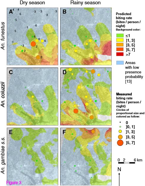
 Parasites & Vectors 2014, 7:103 , Published Online 12 March 2014


 button.


 NOAA’s New GIS Platform Will Increase Availability of Ocean and Weather Data and Applications


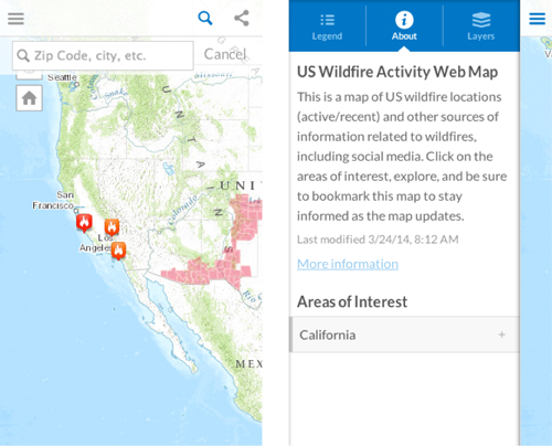
 Pigeon Sim is a Kinect powered, Google Earth linked, system to fly around live data – pulling in feeds from citydashboard.org it was developed originally as part of an EPSRC funded exhibition project (ANALOGIES) in April 2012 by CASA Researcher George MacKerron (now Lecturer at the University of Sussex). It is now part of the ESRC funded TALISMAN project at CASA and Leeds where it is being further developed to link into the DISTANCE Internet of Schools project funded by the TSB.


 In 2008 we launched the


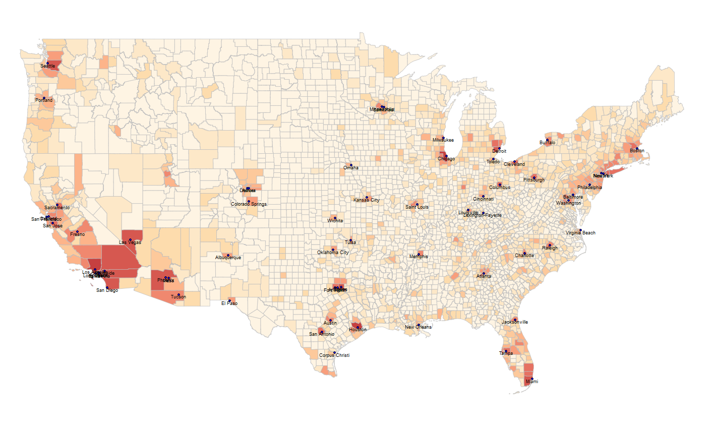


 STATS America is a data portal where visitors can get demographic, workforce, housing, and other data for every state, county, and metro area in the United States. The site is jointly sponsored by the US Commerce Department and Indiana University.


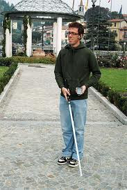
 The Illinois Network of Centers for Independent Living is a statewide coalition of the 23 regional centers for independent living (CIL) that serve Illinoisans with disabilities. CILs promote full and equal access to our communities for those residents and visitors with disabilities. The mission of INCIL is to help these regional centers share resources and collaborate on statewide issues such as funding and advocacy.
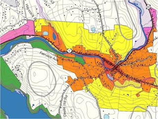
 The Arthritis Foundation's Heartland Region office serves Americans with arthritis throughout the upper midwest. Arthritis affects tens of millions of Americans each year - the second most common chronic condition after heart disease. When your organization's constituent base is that large, it's important to make sure that you're offering services to as many people as possible and to make those services as accessible as possible. In this article, we'll examine how the Arthritis Foundation is using mapping technologies to meet those requirements!


